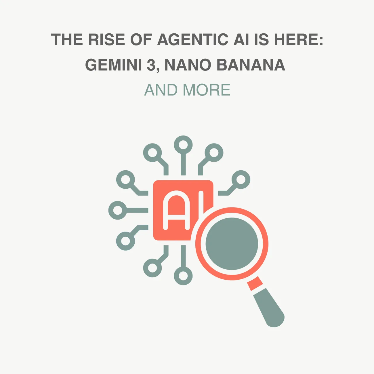
The New Era of AI in 2025: From Gemini 3 to Creative AIs
Learn about the best AI tools for 2025, including Nano...
Make email marketing simplified
Make email marketing simplified
Make email marketing simplified
Make email marketing simplified
Make email marketing simplified
Make email marketing simplified
Make email marketing simplified
Make email marketing simplified
Make email marketing simplified
Make email marketing simplified
Make email marketing simplified
Make email marketing simplified
Make email marketing simplified
Make email marketing simplified
Make email marketing simplified
We use cookies for our website to give you the most relevant experience by remembering your preferences. By clicking “accept”, you consent to use of ALL the cookies
This website uses cookies to improve your experience while you navigate through the website. Out of these, the cookies that are categorized as necessary are stored on your browser as they are essential for the working of basic functionalities of the website. We also use third-party cookies that help us analyze and understand how you use this website. These cookies will be stored in your browser only with your consent. You also have the option to opt-out of these cookies. But opting out of some of these cookies may affect your browsing experience.
Necessary cookies are absolutely essential for the website to function properly. These cookies ensure basic functionalities and security features of the website, anonymously.
| Cookie | Duration | Description |
|---|---|---|
| cookielawinfo-checkbox-functional | 11 months | This cookie is set by GDPR Cookie Consent plugin. The cookie is used to store the user consent for the cookies in the category “Analytics”. |
| cookielawinfo-checkbox-functional | 11 months | The cookie is set by GDPR cookie consent to record the user consent for the cookies in the category “Functional”. |
| cookielawinfo-checkbox-necessary | 11 months | This cookie is set by GDPR Cookie Consent plugin. The cookies is used to store the user consent for the cookies in the category “Necessary”. |
| cookielawinfo-checkbox-others | 11 months | This cookie is set by GDPR Cookie Consent plugin. The cookie is used to store the user consent for the cookies in the category “Other. |
| cookielawinfo-checkbox-performance | 11 months | This cookie is set by GDPR Cookie Consent plugin. The cookie is used to store the user consent for the cookies in the category “Performance”. |
| viewed_cookie_policy | 11 months | The cookie is set by the GDPR Cookie Consent plugin and is used to store whether or not user has consented to the use of cookies. It does not store any personal data. |
Functional cookies help to perform certain functionalities like sharing the content of the website on social media platforms, collect feedbacks, and other third-party features.
Performance cookies are used to understand and analyze the key performance indexes of the website which helps in delivering a better user experience for the visitors.
Analytical cookies are used to understand how visitors interact with the website. These cookies help provide information on metrics the number of visitors, bounce rate, traffic source, etc.
Advertisement cookies are used to provide visitors with relevant ads and marketing campaigns. These cookies track visitors across websites and collect information to provide customized ads.
Other uncategorized cookies are those that are being analyzed and have not been classified into a category as yet.
Cyberia Tech, Inc. respects your privacy. This Privacy Policy explains how we collect, use, and share your information. By using our services, you agree to this policy. If any other agreements conflict with this Privacy Policy, the terms of those agreements prevail.
Cyberia Tech complies with the EU-US and Swiss-US Privacy Shield Frameworks for handling personal data from the EEA, UK, and Switzerland. In case of any conflict, the Privacy Shield Principles prevail. Learn more at Privacy Shield. Key Definitions
Information linked to an individual, transferred from the EEA, UK, or Switzerland to the U.S.
Data revealing race, religion, health, sexual orientation, and similar categories.
Effective Date: [ 2026 / 03 / 24 ]
Welcome to The Cyberia Tech ! By accessing or using our website or services, you agree to
comply with and be bound by these Terms of Use and our Privacy Policy. If you do not agree with
these terms, please do not use our Services.
Loading
0 %Your First Piece of the Puzzle in
Business Growth
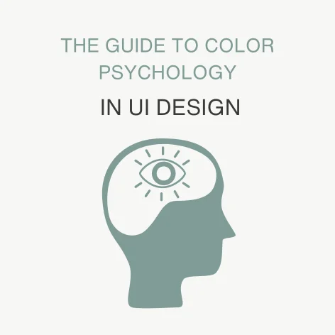

The colors on your screen aren’t just decoration, they speak directly to your users. Every hue and shade influences how people feel, how they behave, and whether they’re able to trust your brand or not.
This is the core of color psychology in UI design: the science of how color affects user decisions. Mastering it is the key to building trust, driving conversions, and creating an experience people love.
In this guide, we’ll explore it all, we’ll talk about how color shapes brand perception and how it can dramatically increase conversion rates. We’ll also look ahead to 2026 trends and the powerful psychology of dark mode. Let’s break it all down.
Your choice of color palette in UI is your brand’s first impression, it’s what users subconsciously notice and instantly connect with. Brands like Netflix with its red and Spotify with its green show how color creates immediate recognition and feelings. The right colors make your brand feel consistent and memorable.
Here’s how you can match colors to brand personalities:
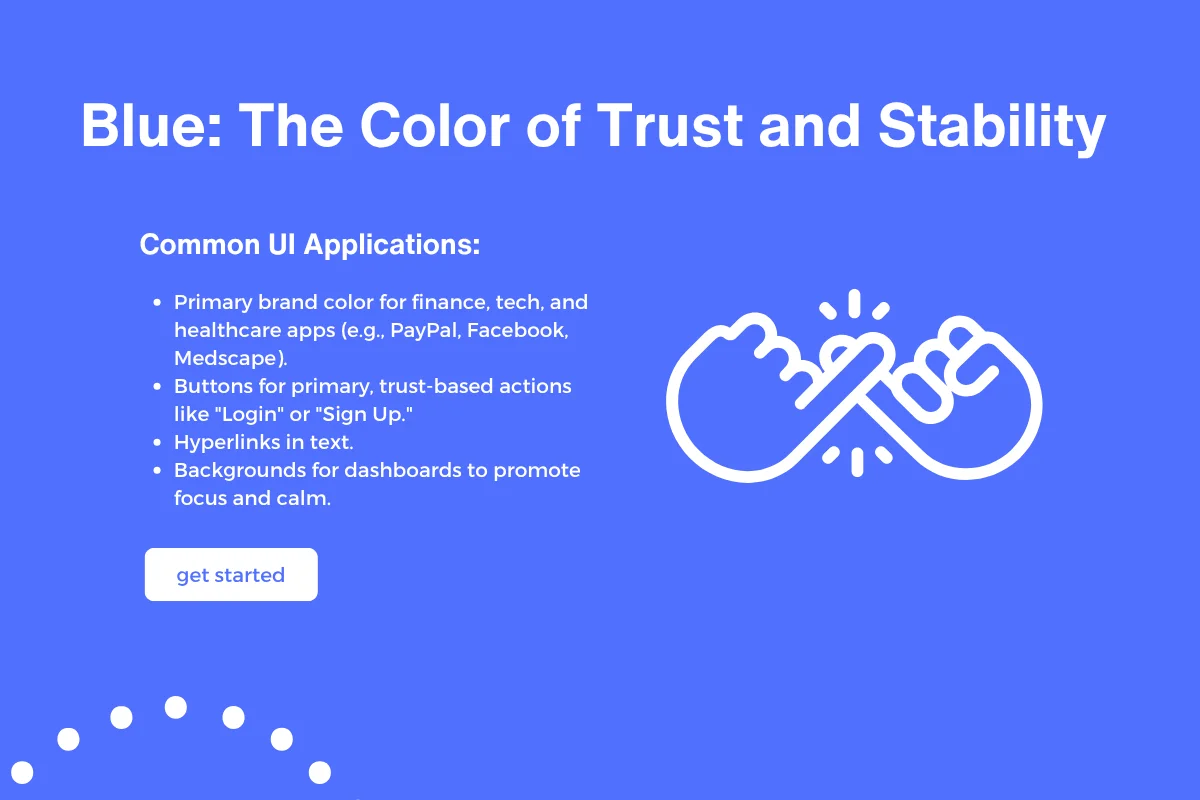
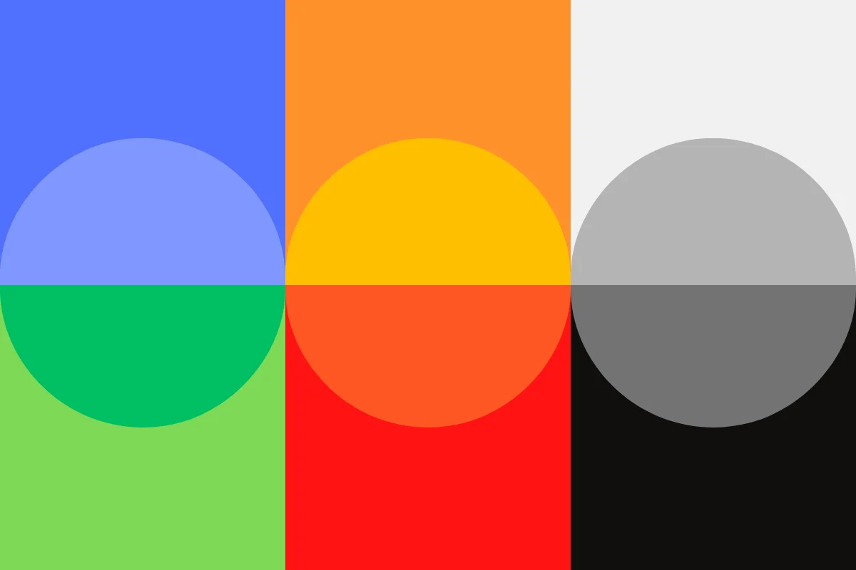
Psychology & Associations: Blue signals trust, security, calm, and intelligence. It’s associated with the sky and the sea, constants in our lives, which gives it a feeling of stability and reliability. However, if overused or in muted tones, it can also feel cold, conservative, or emotionally distant.
Common UI Applications:
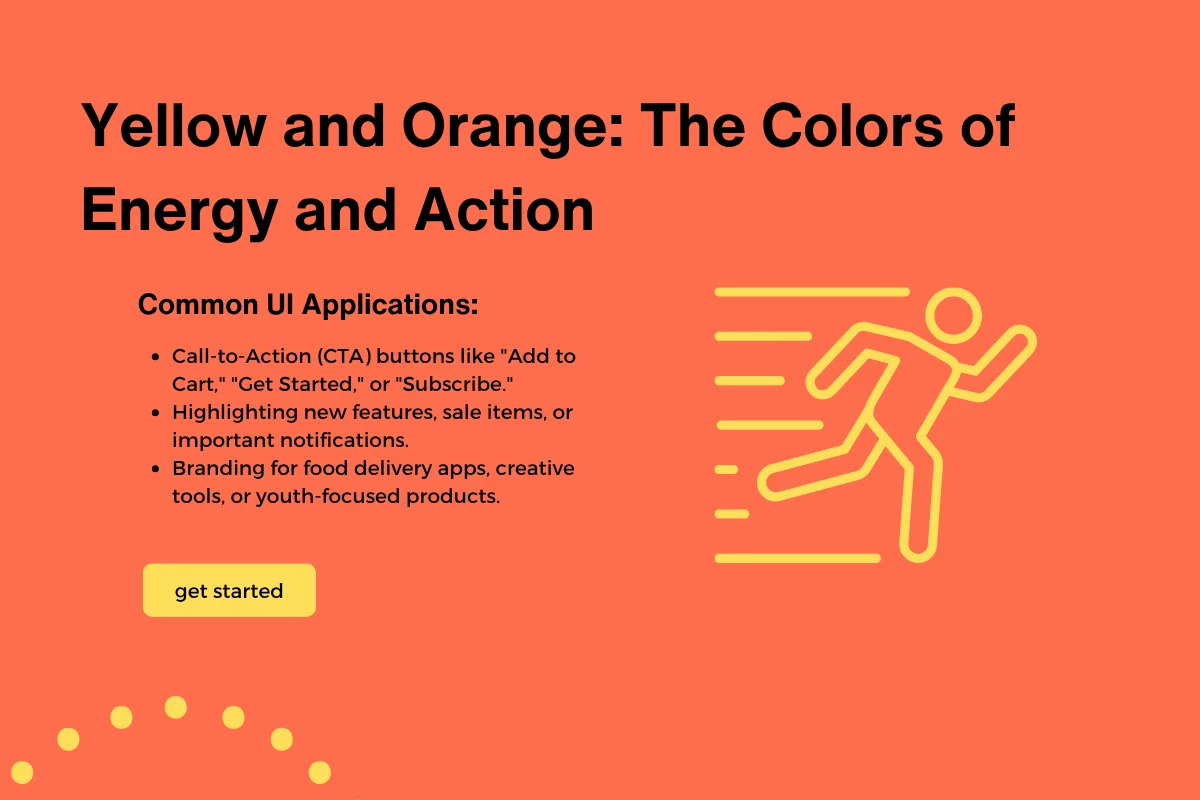
Psychology & Associations: These warm colors radiate energy, optimism, and enthusiasm. Orange is a blend of red’s passion and yellow’s happiness, making it great for encouraging action. Yellow is the most visible color and grabs attention quickly. The downside is that bright yellow can cause eye fatigue, and orange can sometimes feel overwhelming or even cheap if not used carefully.
Common UI Applications:
Psychology & Associations:
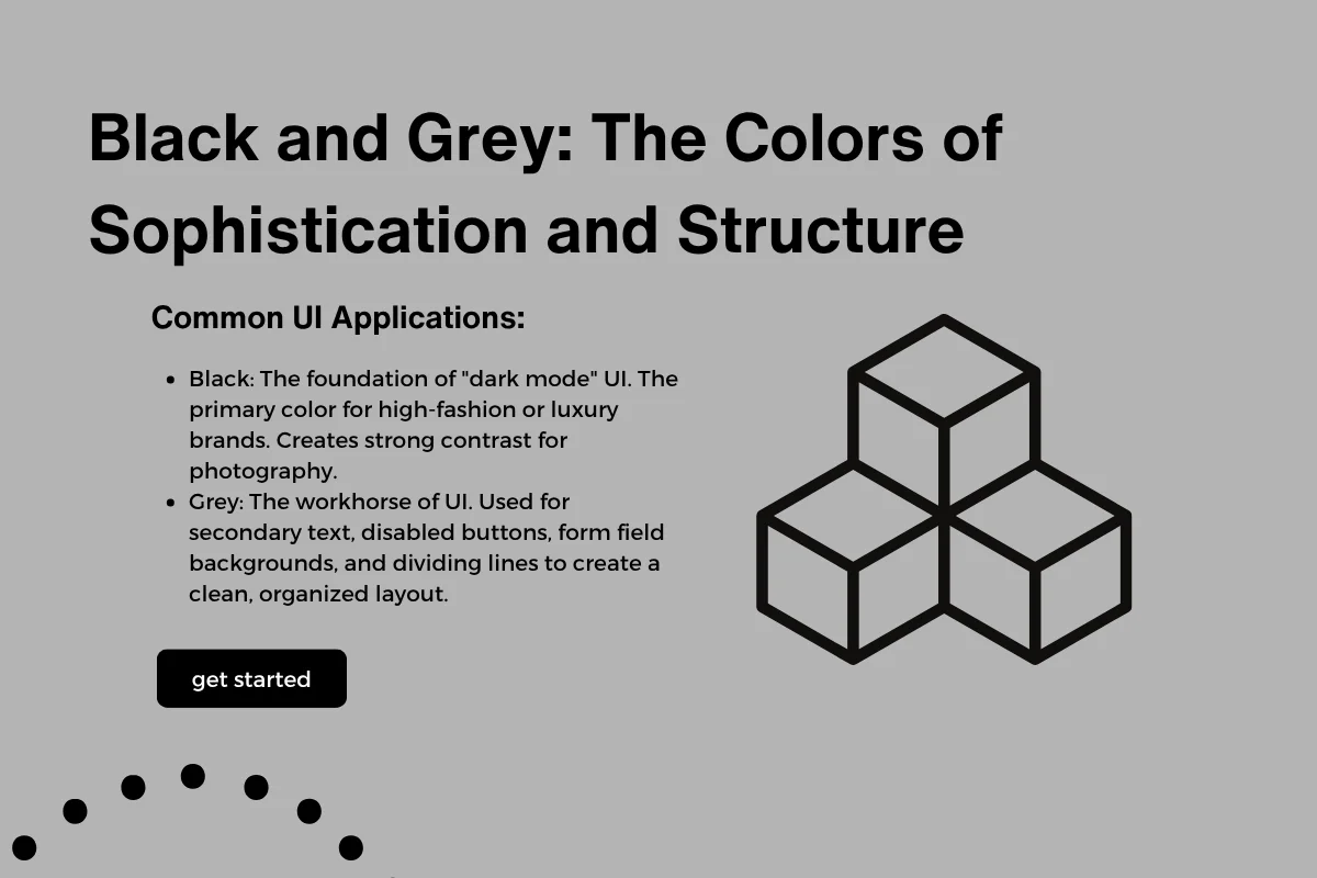
Black communicates power, elegance, and luxury, creating a sense of drama and high value. Grey is the ultimate neutral, signifying balance, professionalism, and calm. It’s an essential supporting color. The potential negative is that too much black can feel heavy or oppressive, while grey can seem dull and passive without a vibrant accent color.
Common UI Applications:
Choosing colors that fit your brand personality helps users instantly understand who you are without reading a word.
Users need to feel safe before they take action on your site or app. Color is a key way to build this trust.
Colors like blue, white, and green are often linked to feelings of security, calm, and professionalism. That is why financial sites, healthcare apps, and ecommerce platforms often rely on these colors.
Also, accessibility plays a big role in trust. Using good color contrast isn’t just about design, it’s about showing respect to all users, including those with visual impairments. When users see that your interface is easy to read and interact with, they feel cared for and are more likely to trust you.
Consistency in color use also reinforces trust. Sudden changes or clashing colors can confuse users and make your site feel unprofessional.
Colors do more than you could imagine. They help guide users toward the actions you want them to take and keep them engaged with your product. If you’re looking for more ways to improve engagement, check out our guide on User Conversion Rate: Proven Tactics That Keep People Coming Back it’s full of actionable methods that pair perfectly with the principles of color psychology.
Understanding color psychology in UI design can help you choose the perfect CTA colors to guide user behavior. For example, the “Isolation Effect” means making your button stand out with a bright or contrasting color so users can’t miss it.
Here’s how some colors work in CTAs:
Beyond buttons, color also helps with engagement by creating a visual hierarchy. For instance, using accent colors to highlight interactive parts of the UI or to show feedback, like green for success messages and red for errors, helps users navigate and understand the interface more easily.
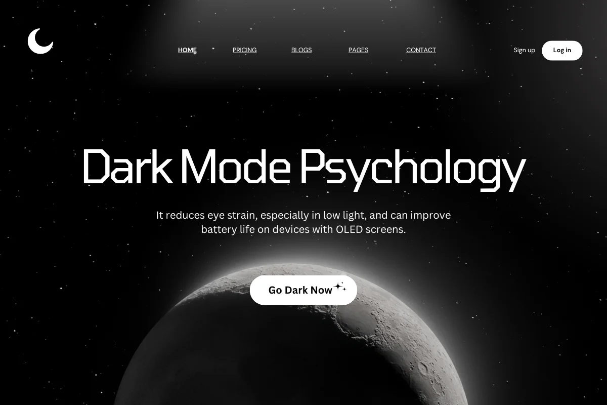
Dark mode has become a major player in color psychology in UI design. It not only reduces eye strain in low light and improves battery life on OLED screens but also creates a sleek, modern aesthetic that changes how users emotionally connect with your interface.
From a psychological perspective, dark mode can make your app feel more immersive and less tiring over long periods. However, it needs bright accent colors or highlights to keep things clear and interactive.
Looking ahead to 2026, expect these color trends to gain ground:
Staying aware of these trends can help you keep your UI fresh and appealing while still rooted in the principles of color psychology.
What is the 6 3 1 golden rule?
The golden ratio helps create balance and harmony in color use. In UI design, the 60:30:10 rule applies this idea: use the dominant color for 60% of the design, a secondary color for 30%, and an accent color for the remaining 10%.
What are the UI colors for 2025?
combine muted neutrals with bold accents like neon yellow, coral, or bright blue. These pops of color add energy, contrast, and visual interest.
Color psychology in UI design is about more than just picking pretty colors. It is a powerful way to communicate your brand’s message, build user trust, guide actions that increase conversion, and keep your design modern with the latest trends.
If you want your users to engage, trust, and convert, carefully consider the colors you use. They speak louder than words.
You Can Get More Information!