The New Era of AI in 2025: From Gemini 3 to Creative AIs
Learn about the best AI tools for 2025, including Nano...
Make email marketing simplified
Make email marketing simplified
Make email marketing simplified
Make email marketing simplified
Make email marketing simplified
Make email marketing simplified
Make email marketing simplified
Make email marketing simplified
Make email marketing simplified
Make email marketing simplified
Make email marketing simplified
Make email marketing simplified
Make email marketing simplified
Make email marketing simplified
Make email marketing simplified
We use cookies for our website to give you the most relevant experience by remembering your preferences. By clicking “accept”, you consent to use of ALL the cookies
This website uses cookies to improve your experience while you navigate through the website. Out of these, the cookies that are categorized as necessary are stored on your browser as they are essential for the working of basic functionalities of the website. We also use third-party cookies that help us analyze and understand how you use this website. These cookies will be stored in your browser only with your consent. You also have the option to opt-out of these cookies. But opting out of some of these cookies may affect your browsing experience.
Necessary cookies are absolutely essential for the website to function properly. These cookies ensure basic functionalities and security features of the website, anonymously.
| Cookie | Duration | Description |
|---|---|---|
| cookielawinfo-checkbox-functional | 11 months | This cookie is set by GDPR Cookie Consent plugin. The cookie is used to store the user consent for the cookies in the category “Analytics”. |
| cookielawinfo-checkbox-functional | 11 months | The cookie is set by GDPR cookie consent to record the user consent for the cookies in the category “Functional”. |
| cookielawinfo-checkbox-necessary | 11 months | This cookie is set by GDPR Cookie Consent plugin. The cookies is used to store the user consent for the cookies in the category “Necessary”. |
| cookielawinfo-checkbox-others | 11 months | This cookie is set by GDPR Cookie Consent plugin. The cookie is used to store the user consent for the cookies in the category “Other. |
| cookielawinfo-checkbox-performance | 11 months | This cookie is set by GDPR Cookie Consent plugin. The cookie is used to store the user consent for the cookies in the category “Performance”. |
| viewed_cookie_policy | 11 months | The cookie is set by the GDPR Cookie Consent plugin and is used to store whether or not user has consented to the use of cookies. It does not store any personal data. |
Functional cookies help to perform certain functionalities like sharing the content of the website on social media platforms, collect feedbacks, and other third-party features.
Performance cookies are used to understand and analyze the key performance indexes of the website which helps in delivering a better user experience for the visitors.
Analytical cookies are used to understand how visitors interact with the website. These cookies help provide information on metrics the number of visitors, bounce rate, traffic source, etc.
Advertisement cookies are used to provide visitors with relevant ads and marketing campaigns. These cookies track visitors across websites and collect information to provide customized ads.
Other uncategorized cookies are those that are being analyzed and have not been classified into a category as yet.
Cyberia Tech, Inc. respects your privacy. This Privacy Policy explains how we collect, use, and share your information. By using our services, you agree to this policy. If any other agreements conflict with this Privacy Policy, the terms of those agreements prevail.
Cyberia Tech complies with the EU-US and Swiss-US Privacy Shield Frameworks for handling personal data from the EEA, UK, and Switzerland. In case of any conflict, the Privacy Shield Principles prevail. Learn more at Privacy Shield. Key Definitions
Information linked to an individual, transferred from the EEA, UK, or Switzerland to the U.S.
Data revealing race, religion, health, sexual orientation, and similar categories.
Effective Date: [ 2026 / 03 / 25 ]
Welcome to The Cyberia Tech ! By accessing or using our website or services, you agree to
comply with and be bound by these Terms of Use and our Privacy Policy. If you do not agree with
these terms, please do not use our Services.
Loading
0 %
Your First Piece of the Puzzle in
Business Growth
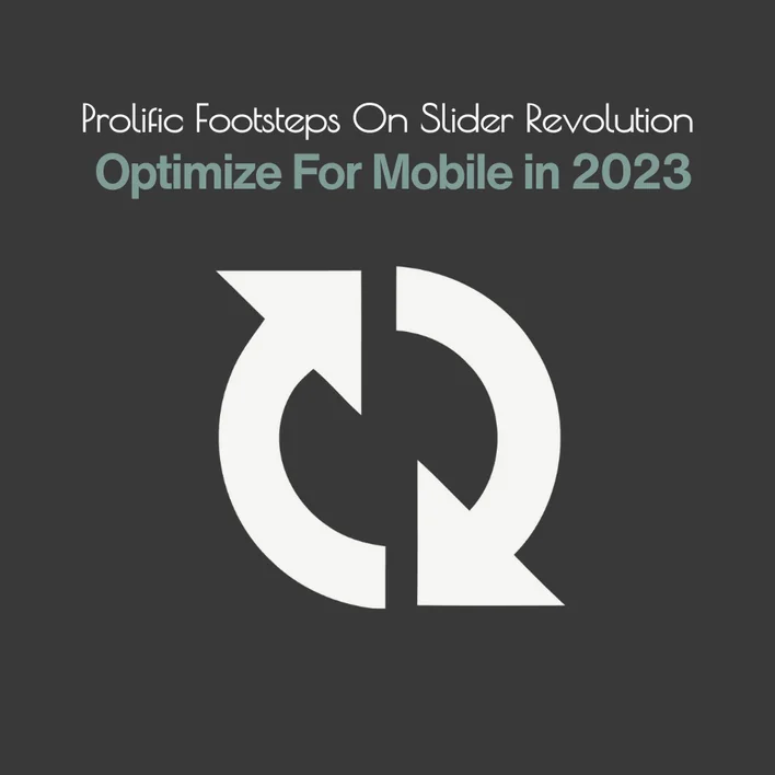
You’ve probably never considered slider revolution mobile responsive. Most of us are unconcerned about what is going on when we see a photo or the contents of our mobile devices. How are they fit in the screen sizes of different devices?
The slider revolution optimized for mobile technology will provide you with a seamless view of what you see on your mobile. A necessity for any web and mobile app development.
Here we explain how many steps are required in slider revolution background image responsive, both on the development and client sides.
Table of Contents
Let’s say you’re enjoying a video or photo on your smartphone, but the content isn’t optimized for your screen size. It’s annoying if you can’t see a photo or video because the screen size is too small, whether you’re on a desktop computer, a tablet, or a smartphone. How does it work?

This moniker, however, has a place on the progressive web application (PWA). This technology is used in both mobile app development and web app development. This technique improves the compatibility and fitness of the device. Another point to consider is image visibility and display in various sizes. It consists of three major steps:
a. First, go to the WordPress panel and activate all of the custom breakpoints.
b. Arrange the image layers
c. Arrange the layers in terms of mobile device visibility so that they can be used with other equipment.
Then you must take the following steps:
When you open the slider revolution, the slider and navigation sidebars are located in the upper and right-hand corners, respectively.
A desktop-shaped icon is located on the upper right side.
When you click on it, the visibility formats on various devices can be altered, allowing you to alternate and toggle the buttons. If all buttons are activated, it is simple to manage content for all varieties of devices.
In fact, slider revolution mobile responsive is a type of tech tailor specifically adapted to a high-end muller cutting system to suit the optimal size of the screen.
The most important thing about a website is how its basic speed settings are set up. So, choose global on WordPress if the screen fits well. Here, several choices will only change the way one slider works. But if you don’t want to focus on one device, just do what we said earlier from A to C:
1. This layer changes how the screen is covered. Step 3’s adjustment is the other important part, and a picture with text needs to be put in the right place as well. In step 3, the “Adjust” part lets you change the font size and where the text is placed.
For each item to be as perfect as possible, you have to make the best cut. The layer area is where you put the general choices for the module.
In the module part, we have:
• Spinner; if you want your page to work better on mobile devices, turn off the slider when it loads.
• Scroll-based controls for 3D effects on the background and individual layers
You can also change the size of the scale on different types of devices. Each gadget has a different level of resolution:
The layout slider has three subcategories to consider: slider, scene, and carousel.
Slider: in the case of having more than one slide
Scene: choose when you have a single slide. But the bullet and arrows are hidden.
Carousel: multiple sliders at the same time. Also, you can use 3d effects.
Other important part of layout is the slider sizing that contains (auto, fullwidth, and Fullscreen)
2. At the next step, you have to pay attention to slider revolution background image responsive and arranging lay, in this case, the source setting, the option that you regulate your background photo to suit shapely.
But the fit cut-off all depends on your image. So, choose the right alignment. Besides if you are not interested on having a transparent background add image from the background part.
But call to mind that you can’t select a different background fit in each device severally, however, you check how each of them will be appeared just by switching through the devices. Remember, note give your slider a name only in lowercase and with dashes.
Also, you can see other options as intelligent inheriting which is better to turn off, since the layer size has to be settled manually for better responsiveness rather than automatic adjustment. The responsive behavior has 3 main factors:
1. Resize between devices (activating the first option allows you to resize the layer to fit different screen sizes.)
2. Responsive offsets (using a layer to adjust to different screen sizes).
3. Responsive children (the layer is nested HTML that may be resized)
As a result, preparing dough for molding and constructing a cake is analogous to this slider revolution for mobile. You use a knife and baking tools to shape the best size feasible. That is the developer’s and this plugin’s helpful hand role.
How do I make revolution slider mobile responsive?
To make the content of your slider responsive, go to the slider editor and pick the device you want to change the content for in the top right corner of the slide. Please keep in mind that you can’t change the background picture this way. You can only change the text in the slides’ layers.
How do I make my slider responsive?
How to Make an Image Slider That Fits Any Screen Taking into account
Step 1: Building blocks of the picture slideshow.
Step 2: Put a picture on the window.
Step 3: Put labels on the picture scroll.
Step 4: Make buttons to change images.
Step 5: Make the picture slider work with mobile devices.
Step 6: Use JavaScript to turn on the Responsive Image Slider.
What is the best size for mobile slider?
The best size for a slider is 1200px wide and between 500 and 800px tall. In fact, these numbers are also used in our models. A smaller slider size also makes it easy to make changes to your slider.
How do you optimize slider revolution?
Bringing about a revolution with Slider Gains in Speed:
1. Be more simple in how you create your theme.
2. Get rid of any old or no longer-used apps.
3. Turn on caching for the browser, page, and RSS.
4. Minimise and postpone CSS and JavaScript.
5. Get a CDN.
6. Mend any broken links.
7. Improve your pictures.
8. Change your plan for hosting.
We can admit that slider revolution mobile responsive helps. If it didn’t exist, developers would have spent much time making sure responsiveness on multiple platforms and screen devices fit well.
To understand this plugin, watch videos and explore different options. Sliding revolution optimized for mobile is easy to understand. The alternatives save time. Thus, slider revolution background image responsive improves the user’s ability to view any image in its entirety.
Discuss this topic and share your experience. Visit our website for any kind of mobile or web app services.
You Can Get More Information!
